

 |
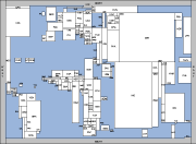
A rectangular cartogram of the world population. Click on the picture for a higher resolution version. |
 check out this game based on rectangular cartograms check out this game based on rectangular cartograms |
Cartograms are a useful and intuitive way to visualize statistical data about a set of regions like countries, states, or provinces. The size of a region in a cartogram corresponds to a particular geographic variable. The most common variable is population: in a population cartogram, the sizes (measured in area) of the regions are proportional to their population. Since the sizes of the regions are not their true sizes they generally cannot keep both their shape and their adjacencies.
There are different types of cartograms, check Cartogram Central for many nice examples. This page focuses on rectangular cartograms, that is, cartograms where each region is represented by a rectangle. This has the advantage that the sizes (area) of the regions can be estimated easily. Algorithmic details on the computation of such rectangular cartograms can be found in
- On Rectangular Cartograms
M. van Kreveld and B. Speckmann.
Computational Geometry: Theory and Applications, 37(3):175–187, 2007.
(special issue of invited papers from the 20th European Workshop on Computational Geometry)
 Java Demo Rectangular Cartograms
- A Linear Programming Approach to Rectangular Cartograms
B. Speckmann, M. van Kreveld, and S. Florisson.
Proc. 12th International Symposium on Spatial Data Handling (SDH), pp. 527-546, 2006.
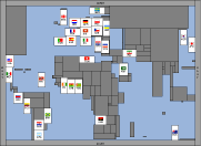
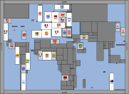
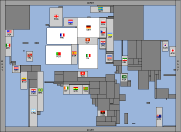
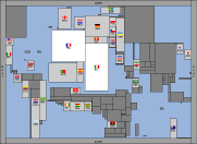
Inspired by the FIFA World Cup in Germany in 2006, we computed a special set of rectangular cartograms that illustrate the course of the tournament. Every cartogram shows all countries or regions with population over one million that participated in the qualification rounds. The 32 countries that qualified are identified by their FIFA country code and flag. Each qualified country starts out with the same fixed size. Every time it reaches a new round in the tournament its size doubles, visualizing its increased chances of winning the tournament. All other countries are shown with their actual area to provide a frame of reference. Click on the tabs above or on the figures for higher resolution versions.
 |
 |
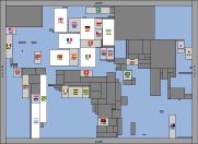 |
Qualified countries |
Round of 16 |
Quarter-Final |
 |
 |
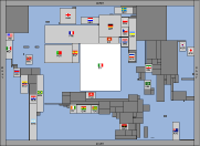 |
Semi-Final |
Final |
Champion |